A lot of the Bootstrap tutorials (including ours) forget to address the problem of responsive text in Bootstrap. I personally have had a hard time finding tutorials on the topic, and have even gone far using FitTextJS, but that’s not the right solution.
The right solution is using media queries. How did I figure this out? I tirelessly experimented while creating my personal site and learnt so much that I am excited to share it with you today. Check out Responsinator by the way.
Why are media queries better than JS scripts is not a matter of personal preference, but rather elegance. Since media query functionality is built into CSS3, it is a logical choice to make use of it, while realizing the great level of control you have.
How to make Text responsive in Bootstrap
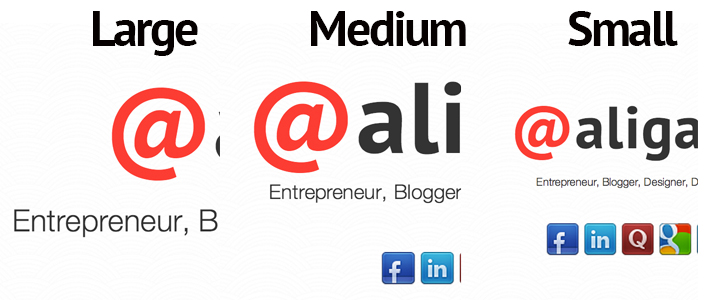
As you can see in the image below, the text on the second line i.e. “Entrepreneur…” becomes smaller and smaller upon each resize. This is achieved through the use of multiple media queries, which can be placed within the custom.css file of your Bootstrap project folder. If you notice, the large header text also resizes but twice – such is the level of control with the use media queries.
There is no HTML code required for this to work. Since media queries is a CSS thing, you simply need some CSS code to detect the screen size and allow the browser engine to do the work for you. Here’s how.
The code below is the media query for the <h1> (large header text). This requires the font-size to be changed to 60px when the width of the screen is below 568px. This means, anything from 0px to 568px will activate the code above and overwrite the defaults automatically.
@media screen and (max-width: 568px) {
        h1 {
	font-size:60px;
	}
}
Now, again, the code below is doing a similar thing, that is, changing the font size of the .lead class. To achieve much more control and accuracy, the media query is used two different times for two different screen sizes. This is to make the text super responsive and not break down into two lines, but instead, stay on a single line only.
@media screen and (max-width: 768px) {
	.lead {
		font-size:20px;
	}
}

@media screen and (max-width: 568px) {
	.lead {
		font-size:0.8em;
	}
}
As far as the font sizes is concerned, you can try px, rem, em and % – can’t really say what works for you. Its usually best to use pixels, but in some cases, you might have issues so the percentages come in very handy. This is it for now. Take care. Comment if you have any further queries.
About Ali Gajani
Hi. I am Ali Gajani. I started Mr. Geek in early 2012 as a result of my growing enthusiasm and passion for technology. I love sharing my knowledge and helping out the community by creating useful, engaging and compelling content. If you want to write for Mr. Geek, just PM me on my Facebook profile.


Pingback: A List of Bootstrap Tutorials | Updated Frequently - Mr. Geek()
Pingback: Responsive text do bootstrap | Hendro Wicaksono's Blog()
Pingback: Responsive text di bootstrap | Hendro Wicaksono's Blog()