Steve Jobs was unarguably the greatest presenter I’ve ever seen in my life time. In fact, he was more. He was a master visionary who just happened to be a great story teller too. This is a powerful combination gentlemen. We all know how Steve and Apple have impacted our lives today. What were the presentation secrets of Steve Jobs? Wait to find out. Over the last year, I have watched countless video footage of Steve Jobs and have come up with a set of presentation secrets that I now would like to share with all of you here.
1. Present what you’re passionate about
Steve Jobs was passionate about how technology could change the world for the better. He wasn’t passionate about mutual funds or racing cars. He talked about what he loved doing. This is secret number one. If you are passionate about the topic of your presentation, it could work wonders for you.
2. Big Picture first
Twitter is a really good example. If you can’t explain yourself in 140 characters or less, you need to go back to the drawing board and rethink a couple of things before you go out and present. Neuroscience research has shown that our brain creates meaning before the details. For example, if you face a tiger, would you ask how many teeth does the tiger have or would you rather ask will it eat me?. Therefore, illustrate the big picture of what you are presenting before giving out the details. Steve Jobs did this all the time.
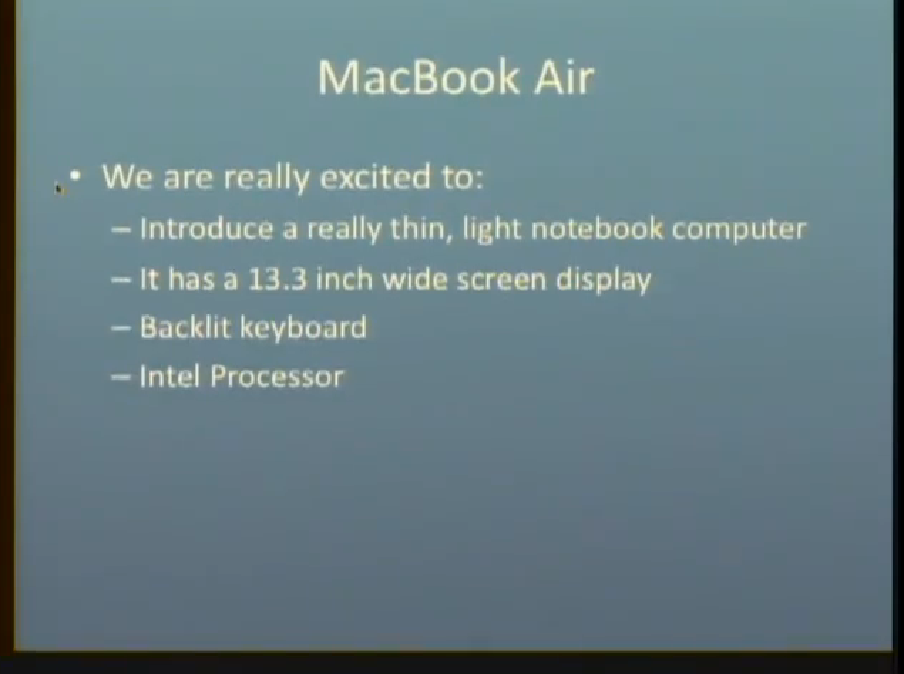
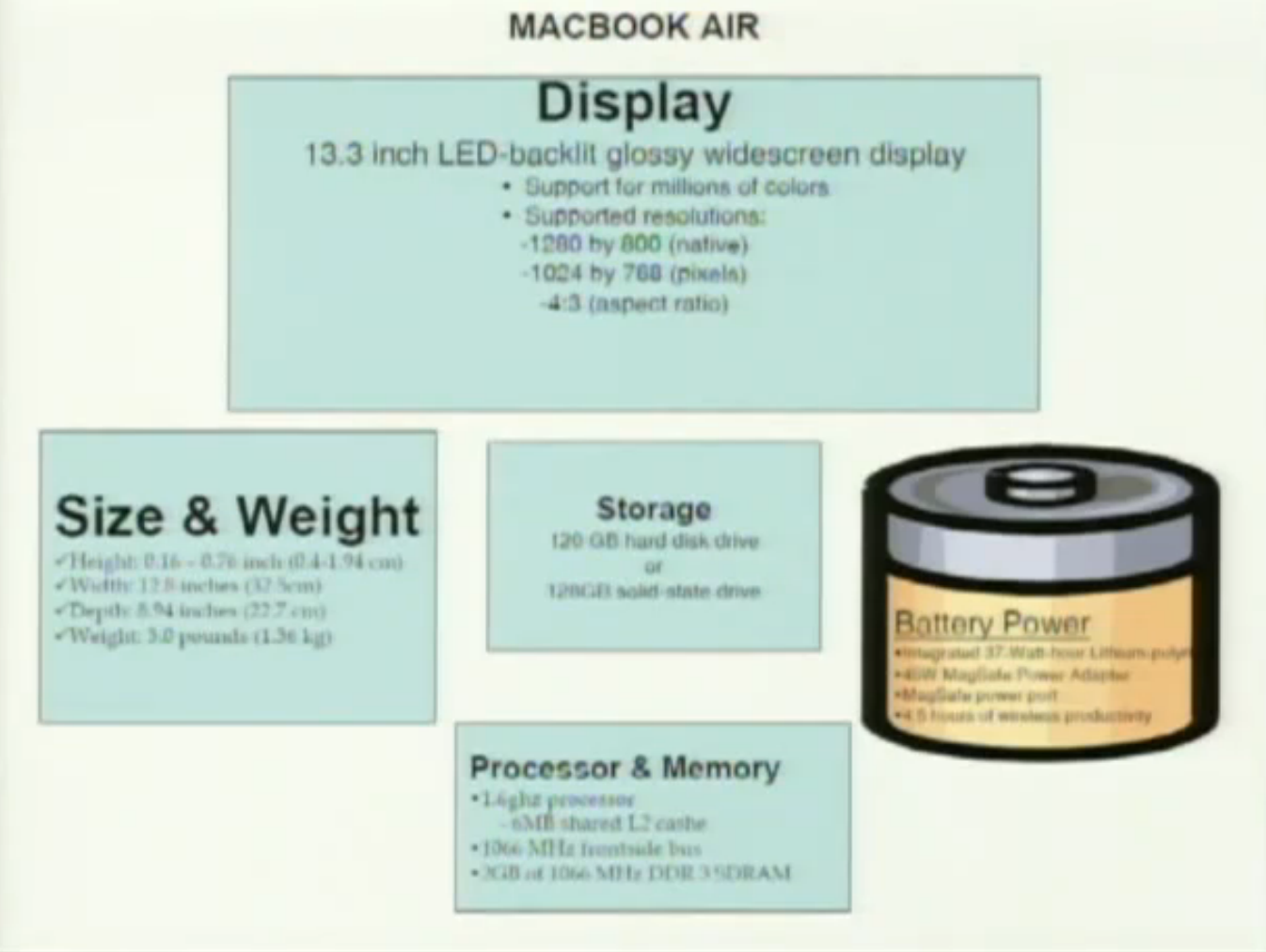
When Steve Jobs introduced the MacBook Air, he delivered the big picture and the meaning before the details. An average presenter would have created something like this.
What’s the problem here? Too much information. What’s the big picture? Simply, It is world’s thinnest notebook. That’s the way Steve Jobs framed it.
The slide is simple, visual and when he delivers it, the one thing that he wants you to remember, that’s all he has on the slide. Presentation genius. Absolutely.
Here’s another example of Steve Jobs introducing the iPad.
As you can see, the content that’s on the slide is all that he wants you to know, before getting into the details. See the magic? Oh by the way, I have noticed one thing. Apple stopped using the phrase at an unbelievable price. You know why? (Laughs)
It takes courage to be simple. Take the Apple website. It’s very much clean, de-cluttered and there’s been a lot of thought put into that as well.
3. Tell a story involving an antagonist
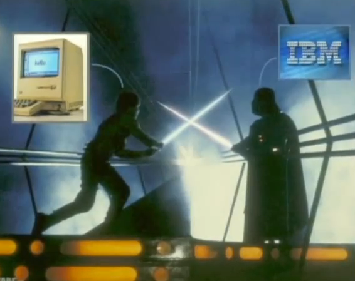
When Steve Jobs introduced the Mac computer in the 80s, IBM was the antagonist.
This idea can be applied in any industry where you are selling a product/service. Obviously, if you can identify a competitor, that becomes your antagonist. Every great story, as Steve Jobs believed, has a hero and a villain and what’s more remarkable is how Steve was successful at implementing this very idea in his presentations.
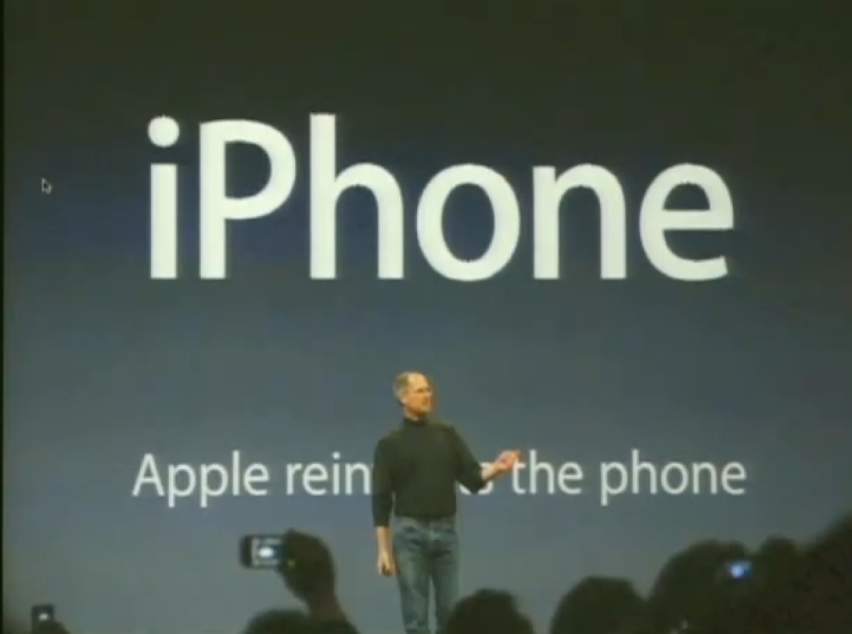
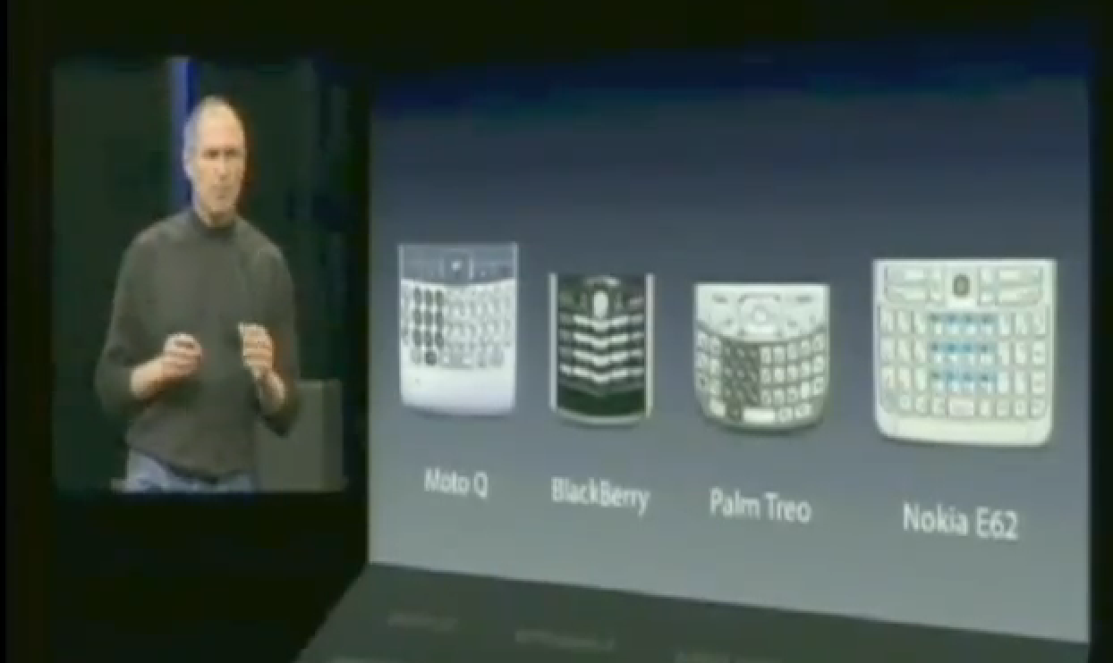
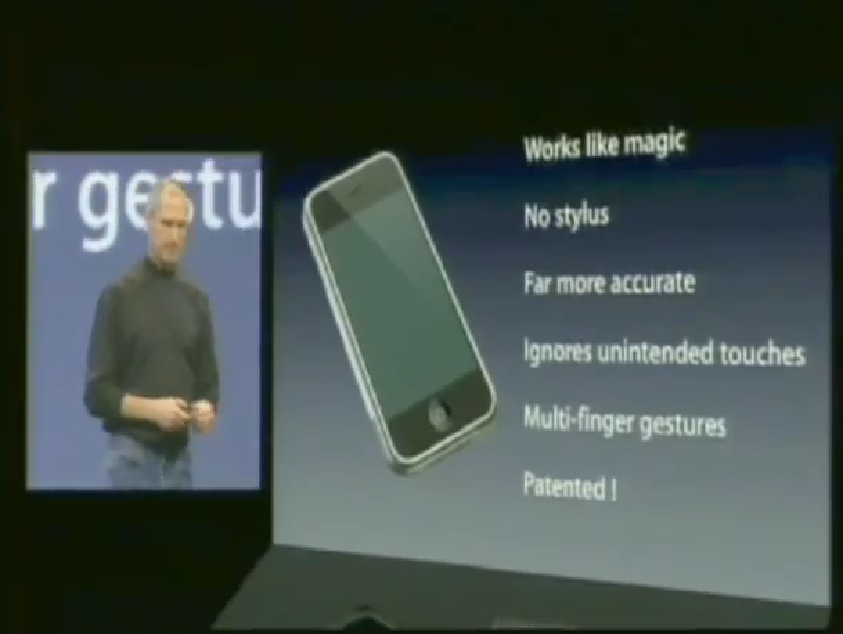
When Steve Jobs introduced the iPhone in 2007, the antagonist wasn’t just one single company, but a category of companies with problems. With that said, he basically outlined how the Apple iPhone was solving those problems. Simple and concise.
Note how his slides are super visual. What can you take from the 2007 iPhone presentation by Steve Jobs is three things: inform, educate and entertain. What made Steve Jobs a master at story telling was the fact that he did those three things at the same time, with great level of accuracy and class.
4. Bring Numbers to Life
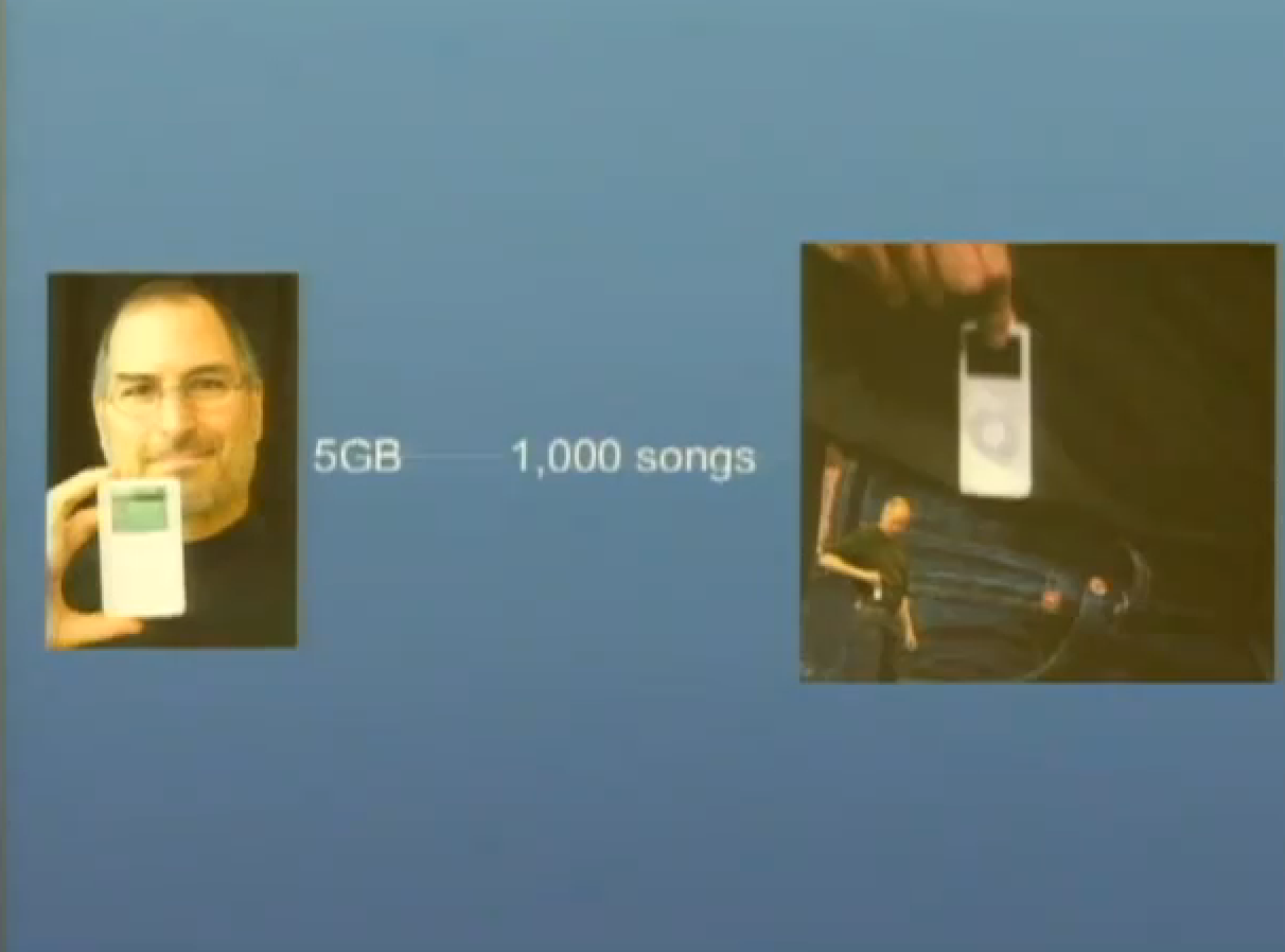
Giving a presentation with lots of number crunching or statistical data points? If you just put out a number there for a statistical point of view without putting it into context, you are doing it wrong. Steve Jobs never included a number which people couldn’t understand. For example, when he introduced the iPod in 2001, he said, it has 5 GB of storage.
What does that mean to any body? 5 gigs of storage, alright so? Who cares? It’s not interesting. So Steve Jobs puts it into context by saying 5 GB means 1000 songs. He goes one step further by adding ‘in our pocket’. That’s a genius right there.
Now that’s interesting and inspiring. What’s the lesson here? The lesson is simple: don’t just throw out a number without putting it into context or being able to relate it to your audiences’ lives. Bring numbers to life!
5. Think Visually
The human brain is made to process information visually, and therefore, it really helps to think visually.
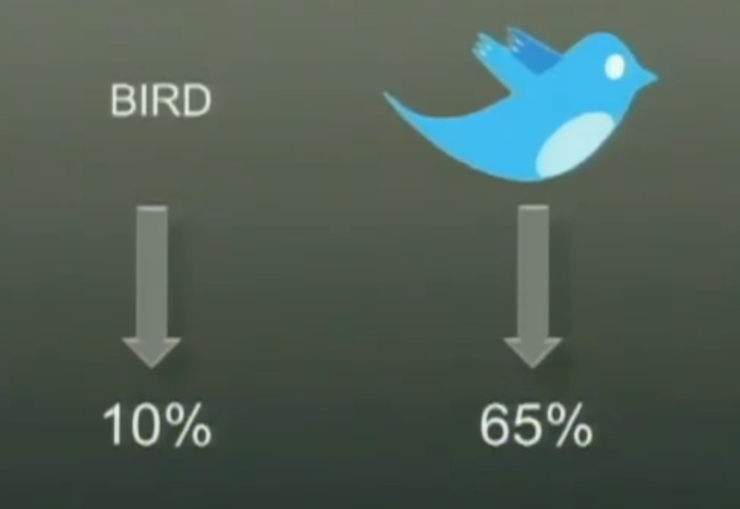
Research has shown that a picture increased the retention rate by 65 %. This is because our brain intreprets each letter of a word as an individual picture and when there are lots of them, the attention span reduces and thus the retention.
Here is how a typical MacBook Air slide would look like.
Here’s how Steve Jobs did it. Look at this. One picture to replace all that text junk. What does the picture say? It says, the MacBook Air is so thin it fits in an envelope. Isn’t that interesting and easily memorable?. It is for sure.
6. Be Animated.
Steve Jobs was an animated character. He used a variety of hand gestures instead of putting his hands quietly in the pocket. Although this won’t really affect how you deliver your presentation, it does put an impression on the audience and it really helps you exhibit the inner energy out of your body.
That’s all. Keeping these 6 presentation secrets in mind can help you improve your presentation styles to a great extent. But whats more important is your ability to belive in your craziness, in your genius and the fact that you can do it!
About Ali Gajani
Hi. I am Ali Gajani. I started Mr. Geek in early 2012 as a result of my growing enthusiasm and passion for technology. I love sharing my knowledge and helping out the community by creating useful, engaging and compelling content. If you want to write for Mr. Geek, just PM me on my Facebook profile.


