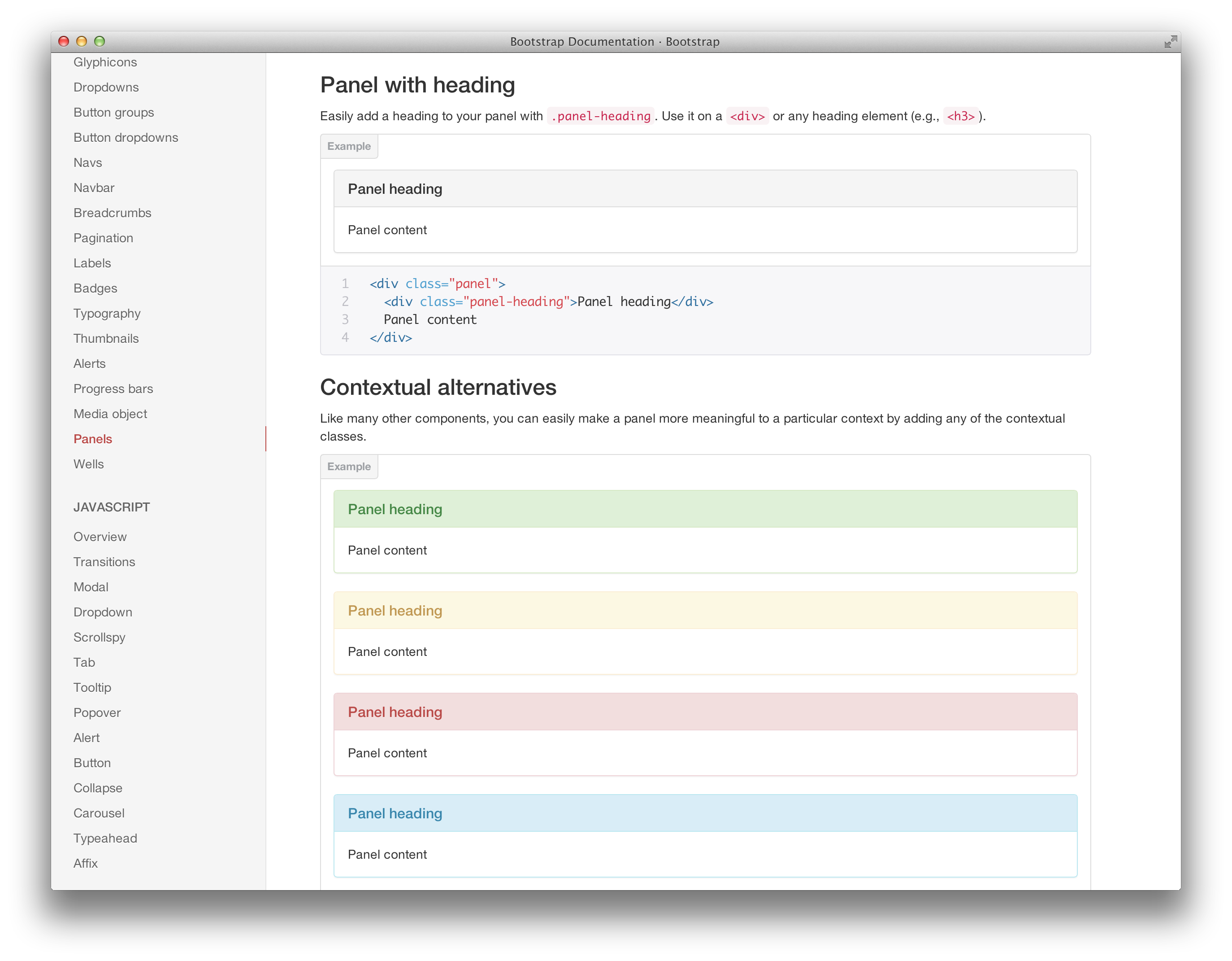
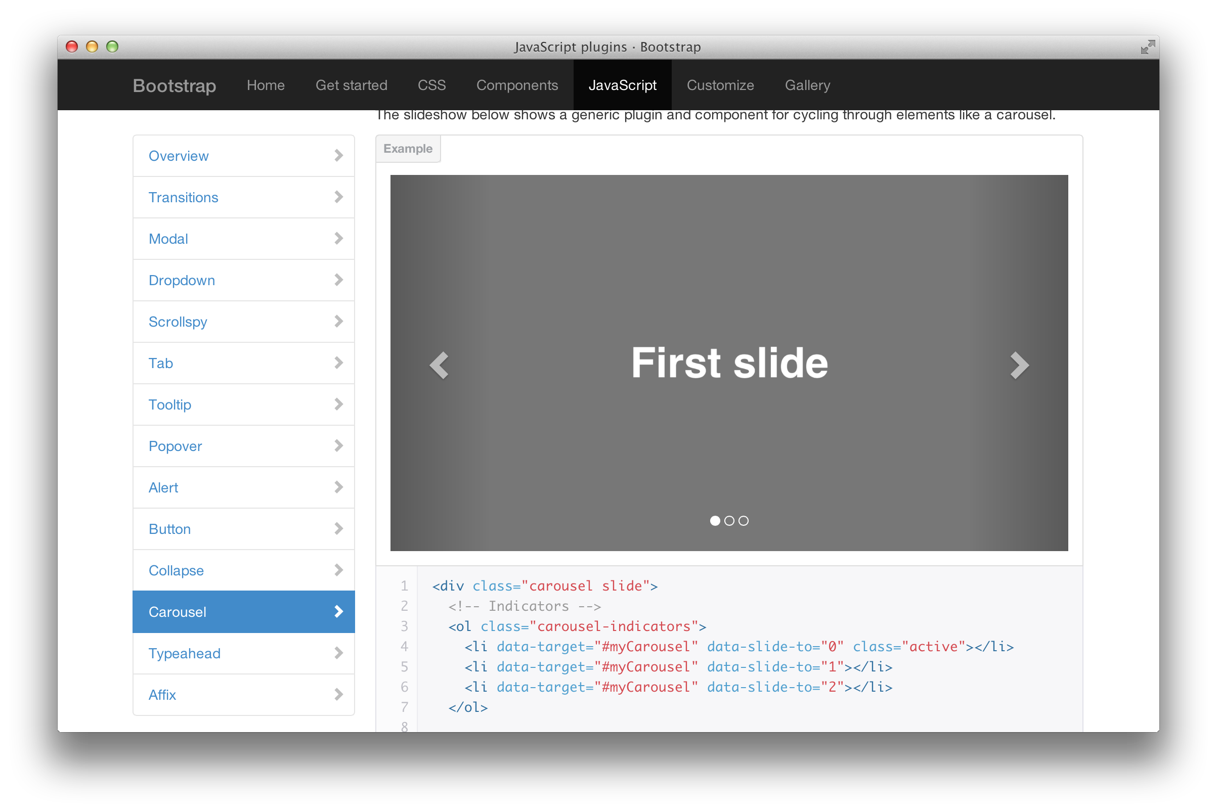
Bootstrap is a highly popular front-end framework built by ex-Twitter engineers @mdo and @fat. If you have been on Mr. Geek before, you know that it is a very popular source for Bootstrap. You can check them all out over here: tutorials.
Bootstap 3.0 is going to be a mobile-first front-end framework. What does that mean? It simply means the framework is written to be mobile friendly from the start. Instead of adding optional mobile styles, they’re baked right into the core. This means mobile first styles are going to be found in the entire library instead of separate files. We believe this is a great step towards building a framework in a world where mobile computing has taken over. Mobile is the future.
Home Page
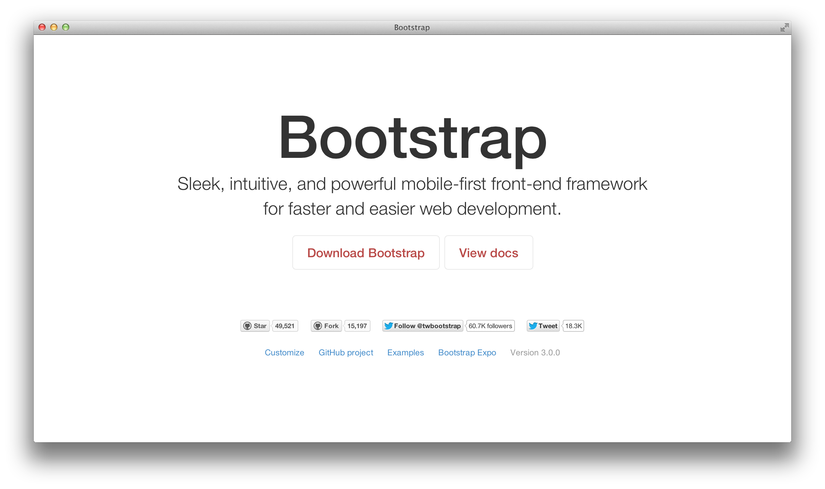
There are going to be a few changes to Home Page such as a link to Bootstrap Expo. This site lists all the other sites that have used Bootstrap in great fashion. It showcases what the Bootstrap can achieve. Also, the home page for Bootstrap 3.0 is going to be minimal. Here’s an image below:
Global Javascript
- Overhaul CSS transitions and reinforce with JavaScript transitions as necessary.
- Drop bootstrap-typeahead and replace with typeahead.js
Global CSS
- At a high level, Bootstrap 3.0 is dropping IE7 and FF3.6 support, combining standard and responsive CSS into a single file, and consolidating additional code as appropriate.
- Responsive CSS is no longer separate and all responsive features are now compiled into the core
bootstrap.cssfile near. Separate files are no longer required, and have thus been removed.
Grid System
- The grid is drastically simpler, yet more powerful, in BS3. We’re transitions back to a single grid system, but with all the awesomeness that was present in the old grids. On top of that, we’ve also added some new features.
- Removed the separate fluid grid system, container, and layout as we’re down to one grid.
- New single grid system (still uses
.row) utilizes percentages over pixels,paddinginstead ofmargin, andbox-sizing: border-boxfor easy math. - The grid is mobile first, meaning it starts out stacked and scales up as necessary to become horizontal via media queries. Previously the grid was built for 940px layouts and scaled up and down.
- Nesting is still 100% supported, but columns will be proportionately sized to their parent, just as the old fluid grid behaved.
- Offsets are still 100% supported.
- Instead of
.span*and.offset*, we’re now using.col-sm-*and.col-lg-*, and.col-offset-*, respectively.
Add small grid system for phones and mini tablets.
- Similar to the default grid system, we’ve added a 12 column small device grid with separate classes from the default responsive grid.
- At screen sizes of 767px or less, use
.col-small-span-*to create mobile-only layouts.
Buttons
- Drop
.btn-inverseas there really is no semantic reasoning for adding it. - The default gray button requires two classes—
class="btn btn-default".
Forms
- Form controls are now 100% width by default, input groups have been overhauled, and form states simplified.
- Switched to
box-sizing: border-box;andwidth: 100%;by default for all textual inputs. - This means you’ll need to specify a size for inputs, whereas before 3.0 inputs had a set pixel width (around 220px) to start.
Icons
- Font icons! Converted to Glyphicons v1.7 @font-face, dropping the old PNGs.
Read more here: https://github.com/twitter/bootstrap/pull/6342
About Ali Gajani
Hi. I am Ali Gajani. I started Mr. Geek in early 2012 as a result of my growing enthusiasm and passion for technology. I love sharing my knowledge and helping out the community by creating useful, engaging and compelling content. If you want to write for Mr. Geek, just PM me on my Facebook profile.


