Bonjour geeks. This is the first of a series titled ‘Getting started with Bootstrap’. The aim of the series on the large is to help you understand the mechanics of using a web design toolkit, that is Bootstrap. Meanwhile, this particular tutorial aims to get you started with using Bootstrap so you can have the skill set of creating a basic responsive template under 1 hour. Without further ado, let’s get started.
I believe this is a good time to explain what a web design toolkit is. To me, a web design toolkit is a framework that assists me to elegantly create the user interface section of my web application in no time. Many people have been calling Bootstrap a toolkit, a CSS framework, a grid system and even a templating system. Yes, these jargons are valid. However, one of the reasons I call Bootstrap a web toolkit is because it comes with an array of tools ranging from Javascript plugins, typography, forms, navigation, buttons to loads of other interface components. In addition, as of version 2.0.3, Bootstrap is a fully responsive and fluid grid system. These two things are key, so it’s time I give you a head’s up.
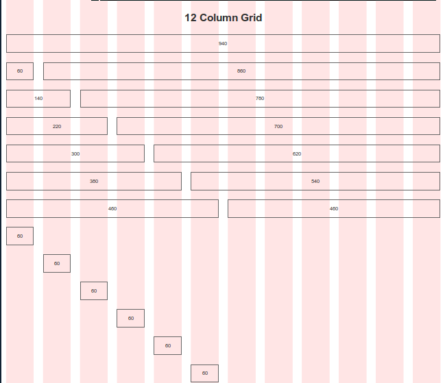
At the core of Bootstrap lay it’s grid system. The grid system basically allows you to create a structured template based on grid. My words will never do justice in this cause so why not explain this graphically. Well, I just did. As you can see in the image below, the grid system allows you to quickly create a design by calling the required classes, which are pre-written for you in the stylesheet provided with Bootstrap. This doesn’t mean you don’t have to write a line of CSS ever again, but it certainly means you won’t have to write much of the CSS as far as design the skeleton of the web page is concerned.
Bootstrap is built by two open source fanatics at a company called Twitter. That’s one of the best reasons to use it, because it’s well managed and updated incrementally. Ok, so Bootstrap is based on the famous 960.gs framework by a guy called Nathan. The grid system within Bootstrap is 960 pixels wide (in default mode) but can be converted to fluid mode (which extends to the full width of the browser). The 960 pixels are then divided into a 12 column grid, with each column assigned 60 pixels each. Do the maths, 12 columns multiplied by 60 pixels is equals to 720 pixels. Oops. Where did the other 240 pixels go. Simple, they are occupied by the gutters, or the small gaps that we have in between the grids, as shown in the picture below. Since each gutter is 20 pixels wide and there are 12 of them, this gets us 240 pixels. Now, if you add up 240 pixels and 720 pixels, you do get 960 pixels.
Using this grid system, you can create a box for content by simply calling the class spanX, where X is number of grids. For example, if you want a box two grids wide, you would simply call span2. It’s that simple. Then, if you want another box besides that, you only have 10 grids to work with. You can call span10 to bring up a large box besides your smaller one. Now, if you try to call more spans, it will disrupt the design since all of the grids have been used for that particular row. We can look into this in more detail by following the tutorial below.
Setting Up Bootstrap
To download Bootstrap, click here. After that, simply click the blue button there (which says Customise and Download). Next, copy the contents of the unzipped folder into a new folder called template. Now, if you have a look into the three folders (/js,/css,/img), you will have the CSS and the JS with a full and minified version, along with the beautiful Glyph icon sprites in white and black. Remember, you should keep the folder safe for the next parts in this series, as you’ll be needing everything.
Creating Your First Page
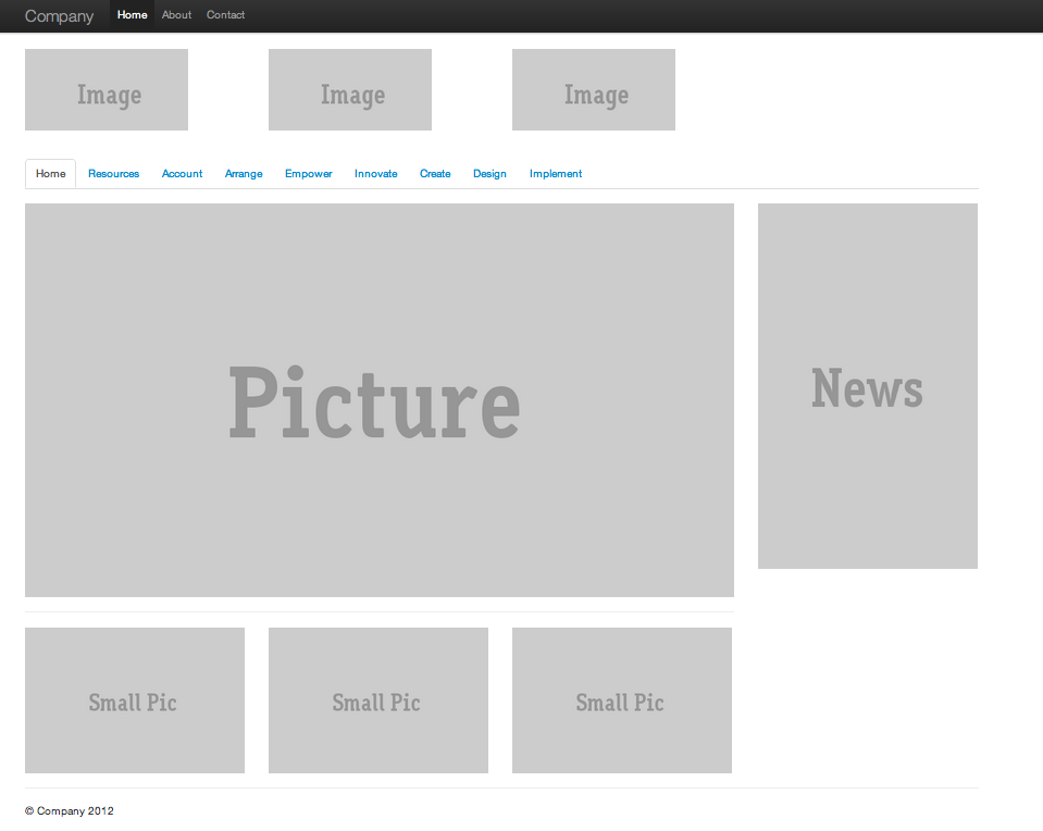
Ok, once you have everything setup, we can finally get going. Before I go deeper, I’d like to show you the final product, so you can see what’s it going to look like (see below). Now remember, if you made this with hand written CSS, it could have taken you hours. However, with Bootstrap, it’s just a matter of minutes. Oh and this is perfectly responsive, so it adjusts to varying screen resolutions. (You can try that with the supplied demo or the .zip file I’ve packaged, for you lazy ones).
The Markup
Let us look at the markup involved in creating the template you saw above. To start off, create a blank HTML page called index.html. Note that for any Bootstrap project you will be working on, you should ensure you equip the your page with the correct header and footer markup. This is by using the minified versions of CSS and JS to increase the performance of the page and reduce load time (if you are making enterprise applications offcourse). The snippet below shows the markup you need to insert at the top of your page. This is self explanatory.
<!DOCTYPE html>
<html lang="en">
  <head>
    <meta charset="utf-8">
    <title>Template</title>
    <meta name="viewport" content="width=device-width, initial-scale=1.0">
    <meta name="description" content="">
    <meta name="author" content="">

    <!-- Le styles -->
    <link href="css/bootstrap.min.css" rel="stylesheet">

     <style type="text/css">
      body {
        padding-top: 60px;
        padding-bottom: 40px;
      }
    </style>

    <link href="css/bootstrap.min.css" rel="stylesheet">

    <!-- Le HTML5 shim, for IE6-8 support of HTML5 elements -->
    <!--[if lt IE 9]>
      <script src="http://html5shim.googlecode.com/svn/trunk/html5.js"></script>
    <![endif]-->

  </head>
Next up is the footer markup. As you can see below, the snippet shows the markup that goes in the footer. This again is very self explanatory.
<hr>
<footer>
<p>© Company 2012</p>
</footer>
</div> <!-- /container -->
<!-- Le javascript
================================================== -->
<!-- Placed at the end of the document so the pages load faster -->
<script src="https://ajax.googleapis.com/ajax/libs/jquery/1.7.2/jquery.min.js"></script>
<script src="js/bootstrap.min.js"></script>
</body>
</html>
Let’s talk about the main body markup of the template. The first chunk of lines show the navigation bar, that is fixed on top, as you saw in one of the images earlier. Not many caveats to this. The core of the template is created in the next chunk of lines starting with <div class=”container” (Remember to wrap your design code with the container open and close tags).
<body>

    <div class="navbar navbar-fixed-top">
      <div class="navbar-inner">
        <div class="container">
          <a class="btn btn-navbar" data-toggle="collapse" data-target=".nav-collapse">
            <span class="icon-bar"></span>
            <span class="icon-bar"></span>
            <span class="icon-bar"></span>
          </a>
          <a class="brand" href="#">Company</a>
          <div class="nav-collapse">
            <ul class="nav">
              <li class="active"><a href="#">Home</a></li>
              <li><a href="#about">About</a></li>
              <li><a href="#contact">Contact</a></li>
            </ul>
          </div><!--/.nav-collapse -->
        </div>
      </div>
    </div>

    <div class="container">
As you can see below, to create a box of any size, we must first call the <div class=”row”>. This line of code ensures that we are dealing with a single row, within which we may create multiple columns (or boxes of content) for our own use. Next, the <div class=”span3″> is being called, which simply creates a column equal to size of 3 grids. We repeat the same thing twice until we have use a total of 9 grids. We are still left with 3 more grids for the particular row, but it doesn’t matter if they aren’t being used; it will never jeopardise the design whatsoever. The use of placehold.it is perfect for creating design mockups. This allows you to create dummy images of any size and overlay a text message on the top. Ideal if you can’t find images of specific sizes.
<!-- Example row of columns -->
      <div class="row">

        <div class="span3">
           <img src="http://placehold.it/200x100&text=Image"/>
        </div>

        <div class="span3">
           <img src="http://placehold.it/200x100&text=Image"/>
        </div>

        <div class="span3">
           <img src="http://placehold.it/200x100&text=Image"/>
        </div>

      </div>

      <br></br>

      <ul class="nav nav-tabs">
        <li class="active"><a href="#">Home</a></li>
        <li><a href="#">Resources</a></li>
        <li><a href="#">Account</a></li>
        <li><a href="#">Arrange</a></li>
        <li><a href="#">Empower</a></li>
        <li><a href="#">Innovate</a></li>
        <li><a href="#">Create</a></li>
        <li><a href="#">Design</a></li>
        <li><a href="#">Implement</a></li>
      </ul>
Ok, so earlier, we discussed how to tap into the power of Bootstrap’s grid system, by creating three boxes of content by utilising 9 individual grids, with each box made up of 3 grids. Now, things get much more interesting. What if you want to have a grids within a grid. This is known as a nested grids. It simply means including a row within a row, where each row then has the specified spans that create the boxes of content out of the grid columns. The markup below shows this. So the parent grid row has a Picture, under which the nested row includes it’s children called Small Pic.
<div class="row">
        <div class="span9">
          <img src="http://placehold.it/900x500&text=Picture"/>
          <hr>
          <div class="row">
            <div class="span3"><img src="http://placehold.it/300x200&text=Small Pic"/></div>
            <div class="span3"><img src="http://placehold.it/300x200&text=Small Pic"/></div>
            <div class="span3"><img src="http://placehold.it/300x200&text=Small Pic"/></div>
          </div>

         </div>

        <div class="span3">
          <img src="http://placehold.it/300x500&text=News"/>
        </div>
      </div>
You can play around with the code by using the .zip file provided. Also, the demo file let’s you see this in action. I would like to add that it has been one heck of a night writing a tutorial about Bootstrap so you all starters can get a good start. I’l say adios now. Subscribe to me personally on fb.com/ali.gajani and Mr. Geek on our social channels to follow all the cool happenings in the geek world, and off course watch out for the upcoming posts in this series. Till then, Ciao!
Live Demo :: Source Code
You can find Part 2 here.
About Ali Gajani
Hi. I am Ali Gajani. I started Mr. Geek in early 2012 as a result of my growing enthusiasm and passion for technology. I love sharing my knowledge and helping out the community by creating useful, engaging and compelling content. If you want to write for Mr. Geek, just PM me on my Facebook profile.











Pingback: Twitter bs (Bootstrap) « TechnoBuzz()
Pingback: 5 Great Twitter Bootstrap Tutorials For Bootstrap Newbies | Twitter Bootstrap Tutorials()
Pingback: 3 Misconceptions about HTML5 - Mr. Geek()
Pingback: Getting Started With Bootstrap: Part 2 of Series - Mr. Geek()
Pingback: A List of Bootstrap Tutorials | Updated Frequently - Mr. Geek()
Pingback: 自定义你的bootstrap | Miao.js()
Pingback: Homepage()
Pingback: 自定义Bootstrap - Nolouch|Bystander()