I have noticed a lot of angel-backed Silicon Valley startups using Bootstrap as their front-end framework of choice. This includes companies like Cinemagram and SocialCam. The reason is simply the awesomeness of the framework and the community it has garnered over the last few years.
I am thrilled to let you know about Mr. Geek’s role in being a popular source of Bootstrap tutorials in the past, especially our Getting Started Series, which amazingly brings us around 60% of the monthly traffic. Today, I am going to give away more to the same community I have benefited from – in form of a Bootstrap tutorial where you will learn to create a complex layout with nesting using Bootstrap.
What are you going to learn
- Complex Nesting with Bootstrap
- Creating a Facebook Timeline-like effect
- Using Media Queries
- Custom Stylesheets
Setting Up
To setup, grab a copy of Bootstrap from here. Once done, you may begin coding. Oh by the way, you might find our tutorial on external stylesheets helpful, so click here.
The Model
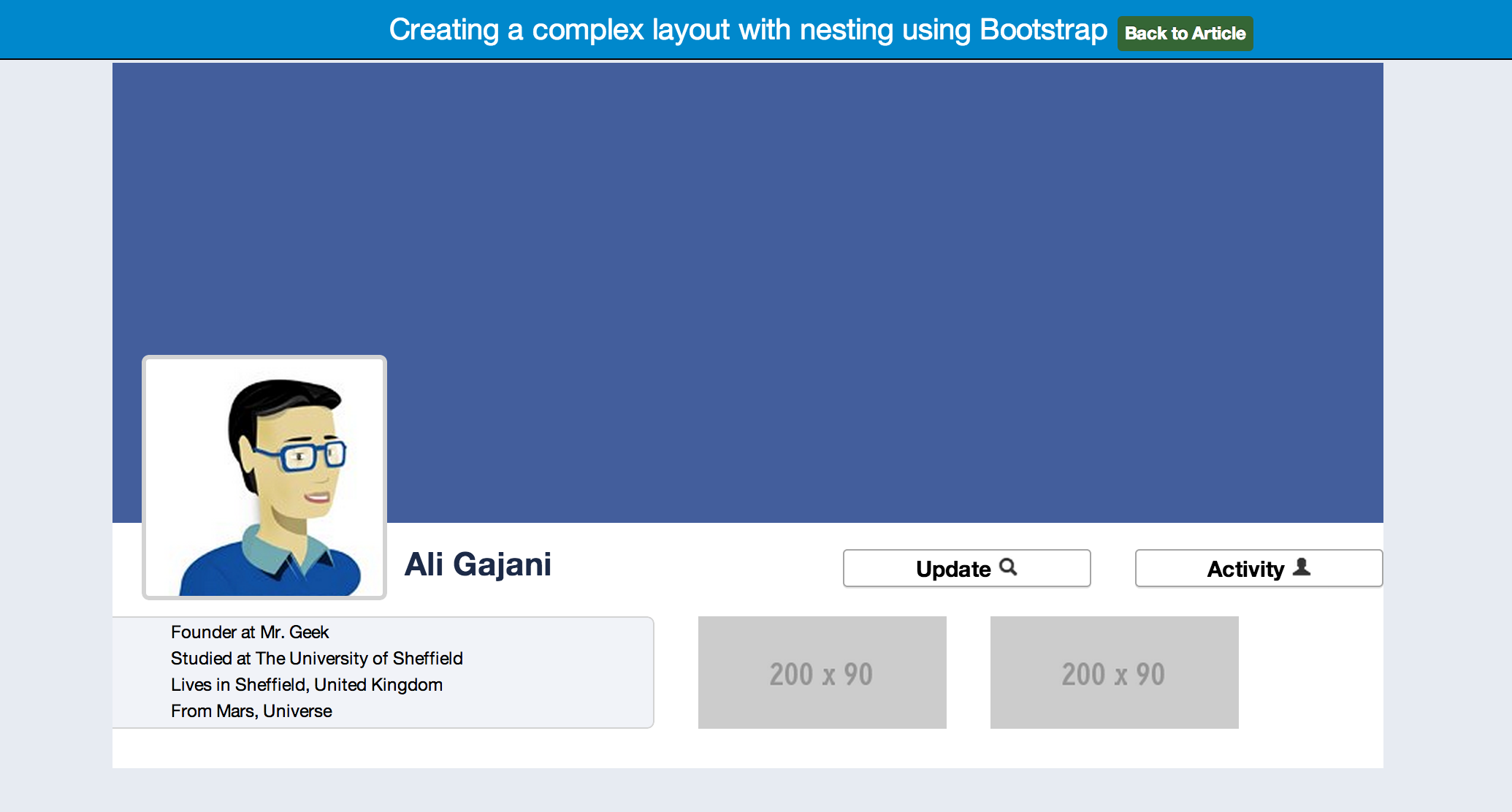
Learning to use Bootstrap’s native nesting features to build complex layouts is skill you will need in your front end engineering career. But why learn nesting by building a Facebook timeline-like webpage. The answer is simple. The complexity. It is the complexity and the multiple levels of nesting that build up a Facebook timeline (the cover and the details section) and it is said that creating something is the best form of learning.
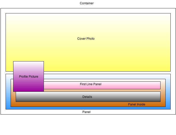
Here is a diagram of how things are structured. This will give you an idea of what is going to happen next. Hint: Always design and refine your idea(s) before going on to create it using code. Note the fair amount of complex nesting of elements.
Linking External Stylesheet
<!-- Bootstrap -->
 <link href="css/bootstrap.min.css" rel="stylesheet" media="screen">
 <link href="css/custom.css" rel="stylesheet" media="screen">
Creating a Container
You will need to create a container. This is where all the content goes in.
<div class="container">
<!-- Everything goes in here -->
</div>
Creating the Cover Photo Area
In order to create the cover photo area, we will create a row with two span elements. The first span9 will occupy the space of 9 grids, with an offset1, leaving the remaining 2 to be occupied by the advertising area, which has a span2. Since Bootstrap uses a 12 grid system, everything is designed on a grid, making things much more logical and organized.
<div class="row"> <!--Row -->
<div class="fb span9 offset1"> <!--Cover-->
<div class="profilePhoto"> Photo </div>
</div> <!--Cover-->
<div class="span2"> <!--Advertisement-->
</div> <!--Advertisement-->
</div> <!--Row-->
If you notice, the Cover photo div also includes a special custom CSS class called fb. This is used for extra styling such as the standard 315px Facebook cover height and the background color, purely for design purposes.
.fb {
 background: #435e9c;
 color:white;
 height:315px;
}
Creating the Profile Photo Box
In order to create a box for holding the profile photo, we have to use a bit of extra CSS coding since Bootstrap can’t do much here. The CSS below shows the class profilePhoto used to position and render the profile photo box just within the Cover picture span area. It also has a Media Query so that the profile photo disappears when the screen size goes below 1200px.
.profilePhoto {
 background:url('https://fbcdn-sphotos-g-a.akamaihd.net/hphotos-ak-snc7/424403_428374530565966_1323885252_n.jpg');
 border:3px solid lightgrey;
 display: block;
 left: 20px;
 margin-top: 200px;
 padding: 1px;
 width:160px;
 height:160px;
 position: relative;
 -webkit-border-radius: 5px;
-moz-border-radius: 5px;
border-radius: 5px;
}

@media screen and (max-width: 1200px) {
.profilePhoto {
display:none;
}
}
Whats next
Ok, so that part was easy. It hardly had any complex nesting requirements and we have created a basic skeleton for the Facebook timeline-like web page. But now things get more complex as we go into multiple levels of nesting – but with Bootstrap’s native features, it all seems a breeze. By the way, as you read the code, note how HTML comment tags have been utilized to allow us to keep track of the multiple nesting levels.
Creating the Panel
The Panel area is the portion that goes below the cover photo, holding details like name, buttons, about information and other things. The panel area has two separate parts a) First line Panel that holds the name and the buttons and b) Details like information and photo boxes. In order to create the Panel area, we first create a new row, just below the previous row (which was used for the upper portion of the timeline i.e. Cover Photo).
The reason for not nesting it inside the Cover photo row is simply because of simplicity and elegance. It would have worked but then we would have had to push it down using extra CSS like margin-top and padding-top. Always minimise your code. Speed and performance are important!
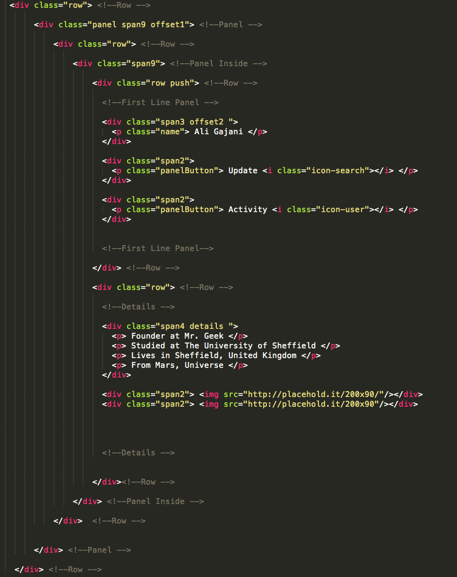
The code below shows the opening of the HTML elements used to create the nesting effect. As you can see below, line 1 opens up the row which holds the panel span9 offset1 (line2). This code essentially creates a wrapper setting for the sub parts that we discussed earlier like a) First line Panel and Details. Then, line 3 and 4 show the element span9 (Panel Inside) which acts as a safety wrapper.
<div class="row"> <!--Row -->
<div class="panel span9 offset1"> <!--Panel -->
<div class="row"> <!--Row -->
<div class="span9"> <!--Panel Inside -->
Just in case you were wondering what is the panel class used for in line 2 in the HTML code snippet above – it is simply styling.
.panel {
 height:168px;
 background:white;
 color:black;
}
Creating the First Line Panel
Now, once we have created the required wrapper elements (containers as some might call it), we go one step further to create the First Line Panel that holds crucial data for the timeline user like name and buttons. As you can see the HTML code snippet below, we create another row to hold the contents (name, buttons) using spans. We utilize offsets to position the spans horizontally. By now, we are at level 3 of nesting.
<div class="row push"> <!--Row -->

<!--First Line Panel -->

<div class="span3 offset2 ">
 <p class="name"> Ali Gajani </p>
 </div>

<div class="span2">
 <p class="panelButton"> Update <i class="icon-search"></i> </p>
 </div>

<div class="span2">
 <p class="panelButton"> Activity <i class="icon-user"></i> </p>
 </div>

<!--First Line Panel-->

</div> <!--Row -->
The push class in line 1 is to push the things down just for the sake of design and alignment.
.push {
 margin-top:18px;
 padding-bottom:10px;
}
Creating the Details box
Now, just below the previous First Line Panel, we create another row to hold the Details box. Here’s how. It is again very self explanatory of how this works. Also, the details CSS class is in the custom.css file for you to look at along with other minor custom features coded to achieve the look-and-feel of a Facebook timeline.
<div class="row"> <!--Row -->

<!--Details -->

<div class="span4 details ">
 <p> Founder at Mr. Geek </p>
 <p> Studied at The University of Sheffield </p>
 <p> Lives in Sheffield, United Kingdom </p>
 <p> From Mars, Universe </p>
 </div>

<div class="span2"> <img src="http://placehold.it/200x90/"/></div>
 <div class="span2"> <img src="http://placehold.it/200x90"/></div>

<!--Details -->

</div><!--Row -->
Conclusion
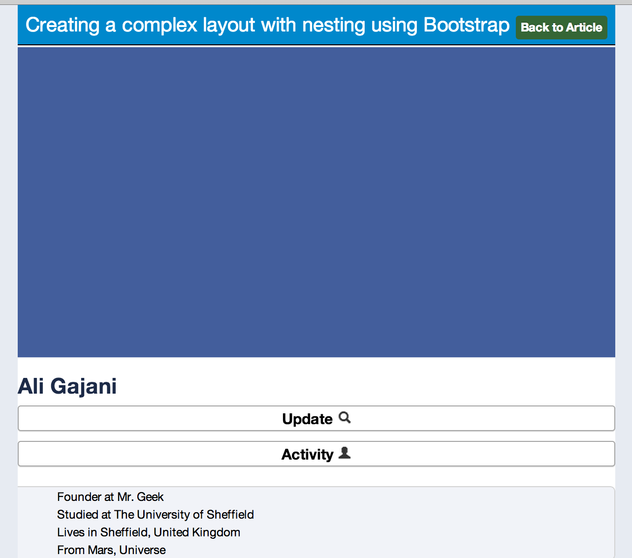
This was it. Nesting with Bootstrap can be used to create complex layouts with a minimal effort and even though you can use custom.css to achieve some unique effects, they aren’t required at all for you to create complex multiple level nested layouts using Bootstrap. By the way, here are a few pictures you might enjoy seeing.
Fully Responsive
Nesting as in Code
About Ali Gajani
Hi. I am Ali Gajani. I started Mr. Geek in early 2012 as a result of my growing enthusiasm and passion for technology. I love sharing my knowledge and helping out the community by creating useful, engaging and compelling content. If you want to write for Mr. Geek, just PM me on my Facebook profile.











Pingback: A List of Bootstrap Tutorials | Updated Frequently - Mr. Geek()