I’ve just downloaded Apple’s OS X 10.10 Yosemite pre-release. You might ask, how did I get my hands on it? Well, as an owner of a Developer account, I have access to beta releases from Apple right from their developer portal. It costs 99 bucks a year but it’s worth it. Here’s a hands on review of Yosemite, where I shall discuss the good and the bad.
Getting Yosemite
At the moment, you have two options.
- https://appleseed.apple.com/sp/betaprogram/welcome (Late)
- Ready to make your wallet 99 bucks lighter? Click here (Now)
What the Beta lacks?
According to Apple: “the beta software is unfinished, some new features will not be available, such as phone calls, SMS, Handoff, Instant Hotspot, and iCloud Drive. Spotlight suggestions are U.S.-based only. Some applications and services may not work properly with the beta software. If you are using iCloud Documents on Mavericks and you are also a member of the iOS Developer program, your documents will not sync across your other Macs and iOS devices.”
First Look into Yosemite
From the outset, Yosemite looks very different. It has a new feel to it, and yes, it’s flat, a natural progression for any Apple UI after iOS 8. I will try to keep this hands on review simple, so less words and more pictures. Here we go.
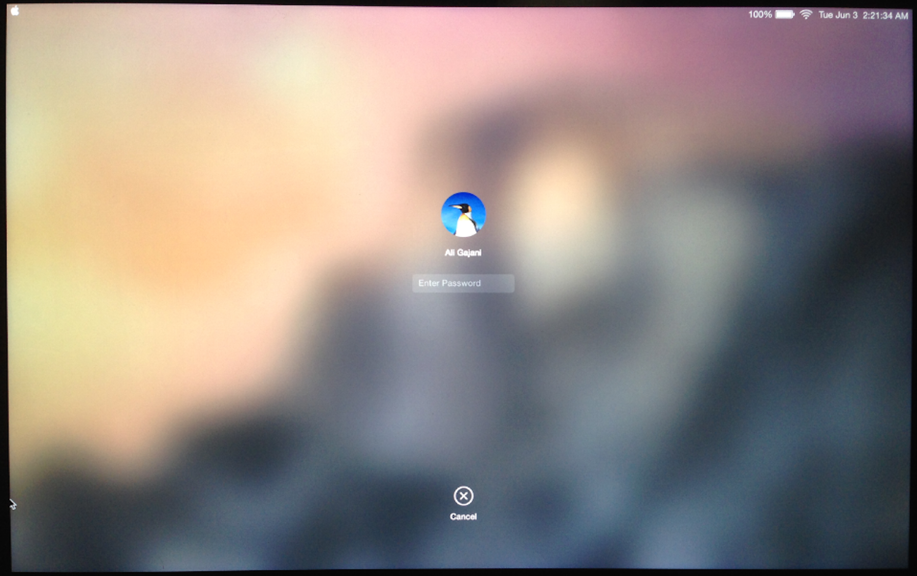
Login Screen
The Login screen indicates and gives hints of what’s to come. Flat baby!
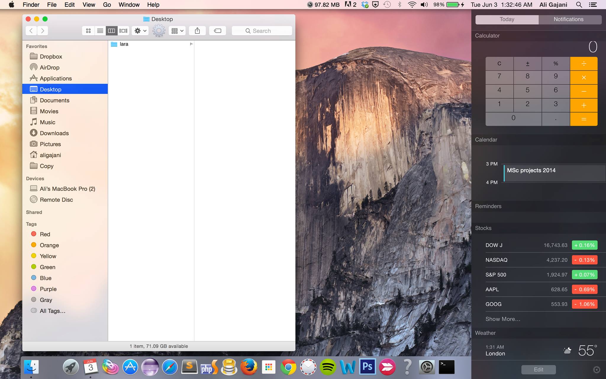
Desktop View
As soon as we login, the Desktop welcomes us with a breezing new design. It’s fairly flat and clean.
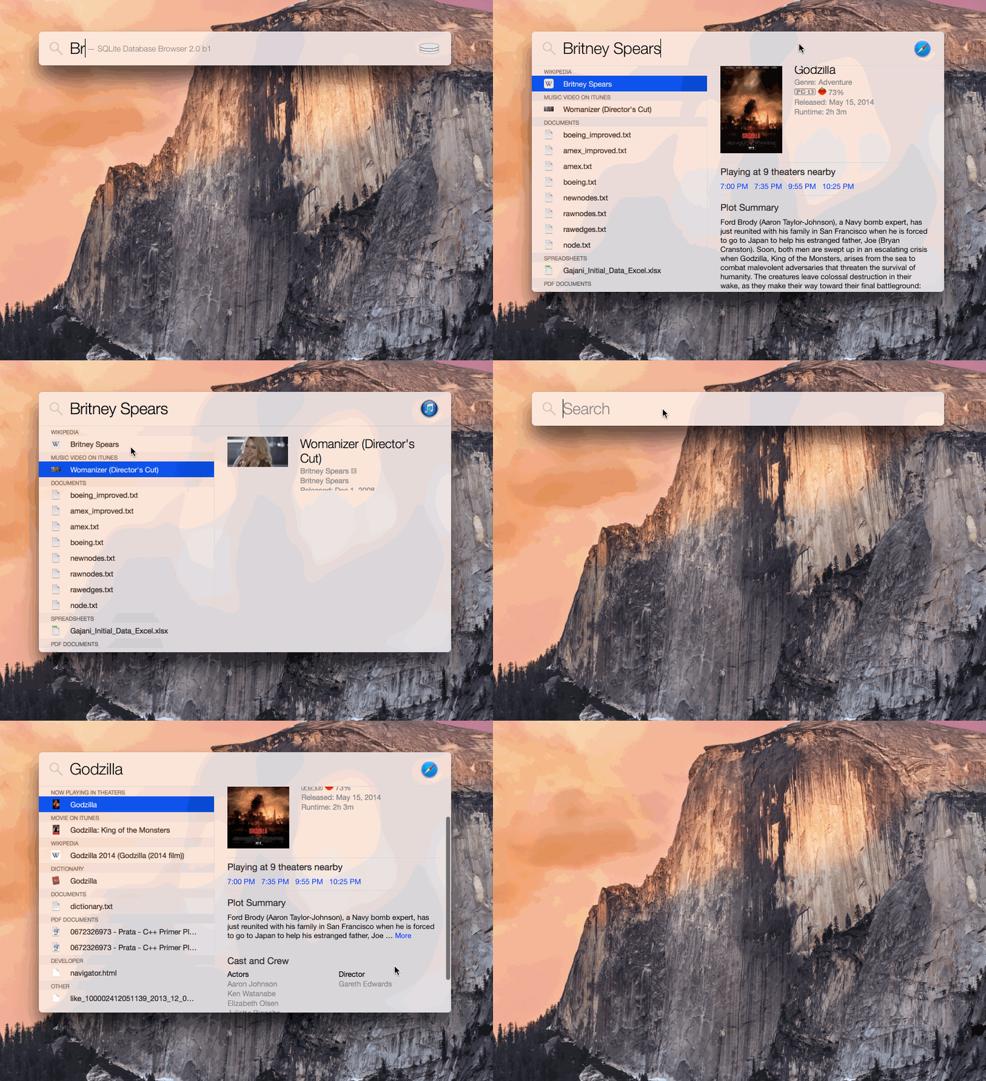
Spotlight Revealed
The new Spotlight just killed Alfred App (a popular app on the Mac app store). It’s gorgeous.
The Dock
For this image, it might be worth clicking it to expand it into a light box. The Dock has a redesigned look, and the icons are crafted beautifully. I’d wanted a bit more variety but it does look softer on the eyes. Scroll down to see dock animation. Give it a while to load as it’s around 9.4 in GIF.
The Dock Animation
Note the subtle details in the Settings icon. However, the animation remains the same.
The LaunchPad
Well, the Launchpad resonates the new design and I think there isn’t much to see here. Move on.
Safari
The new Safari is stunning, sleek, neat and well crafted. What do you think? I like it.
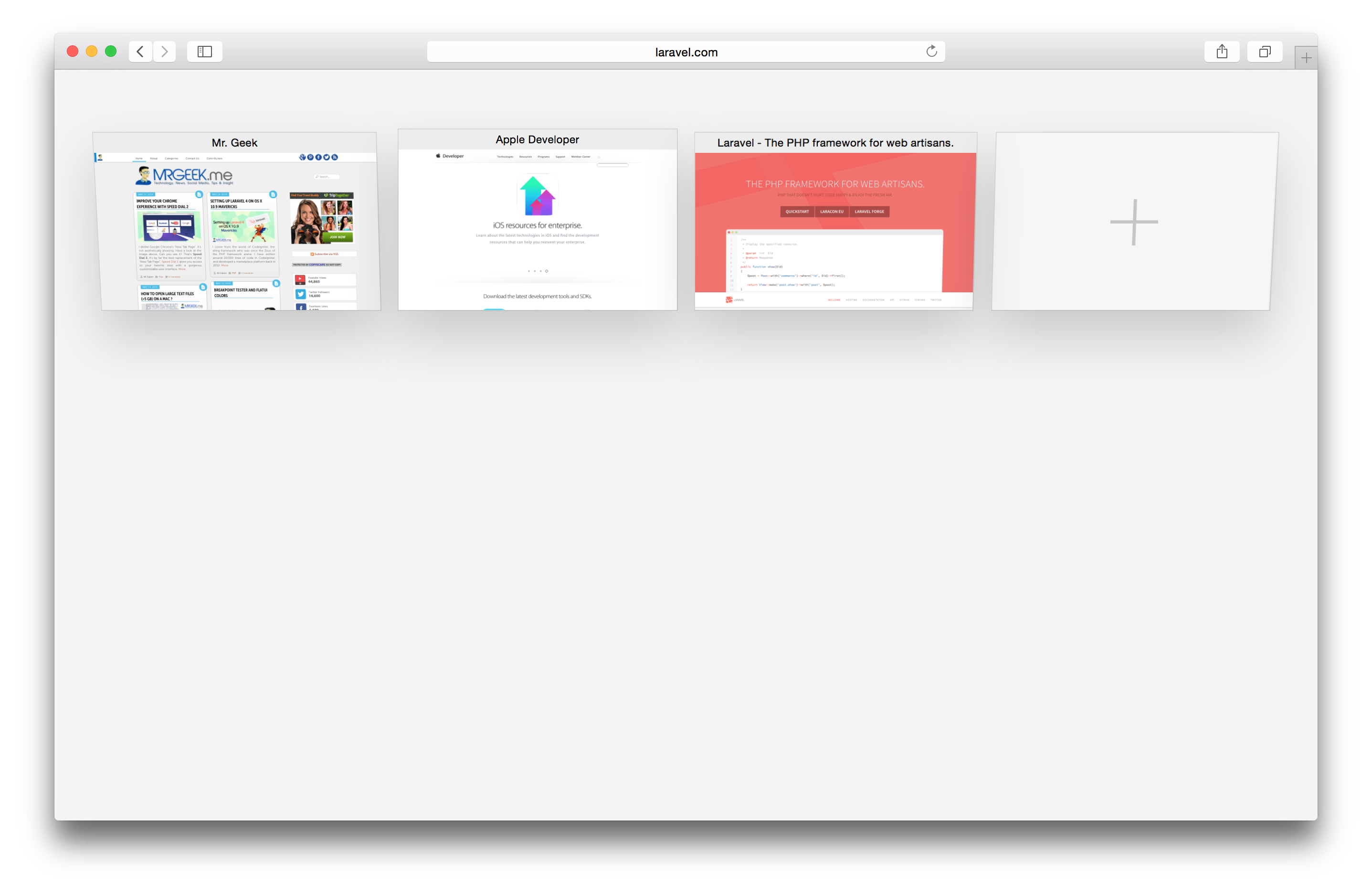
The Safari Jitter
One of our tabs in the new Safari has been diagnosed with epilepsy. It’s a bug.
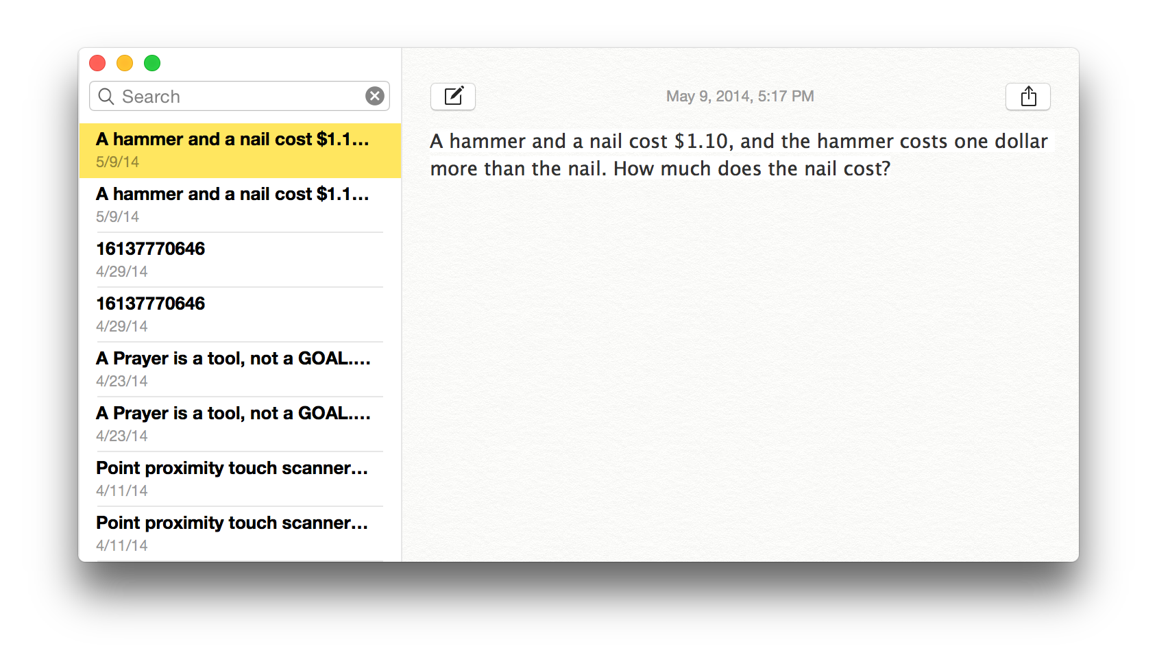
The Notes App
Oh boy, the Notes are duplicating in the new OS X Yosemite. Well, another bug.
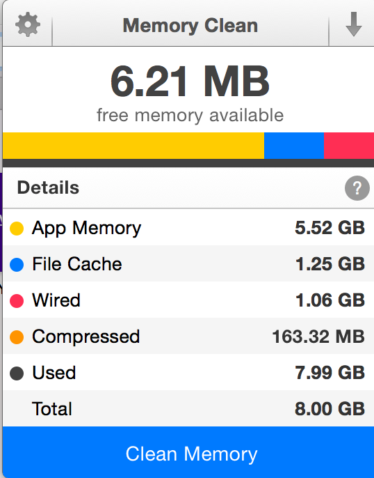
Well, what about Memory ?
Looks like the OS X Yosemite is a memory eater. I only had Safari and Chrome open.
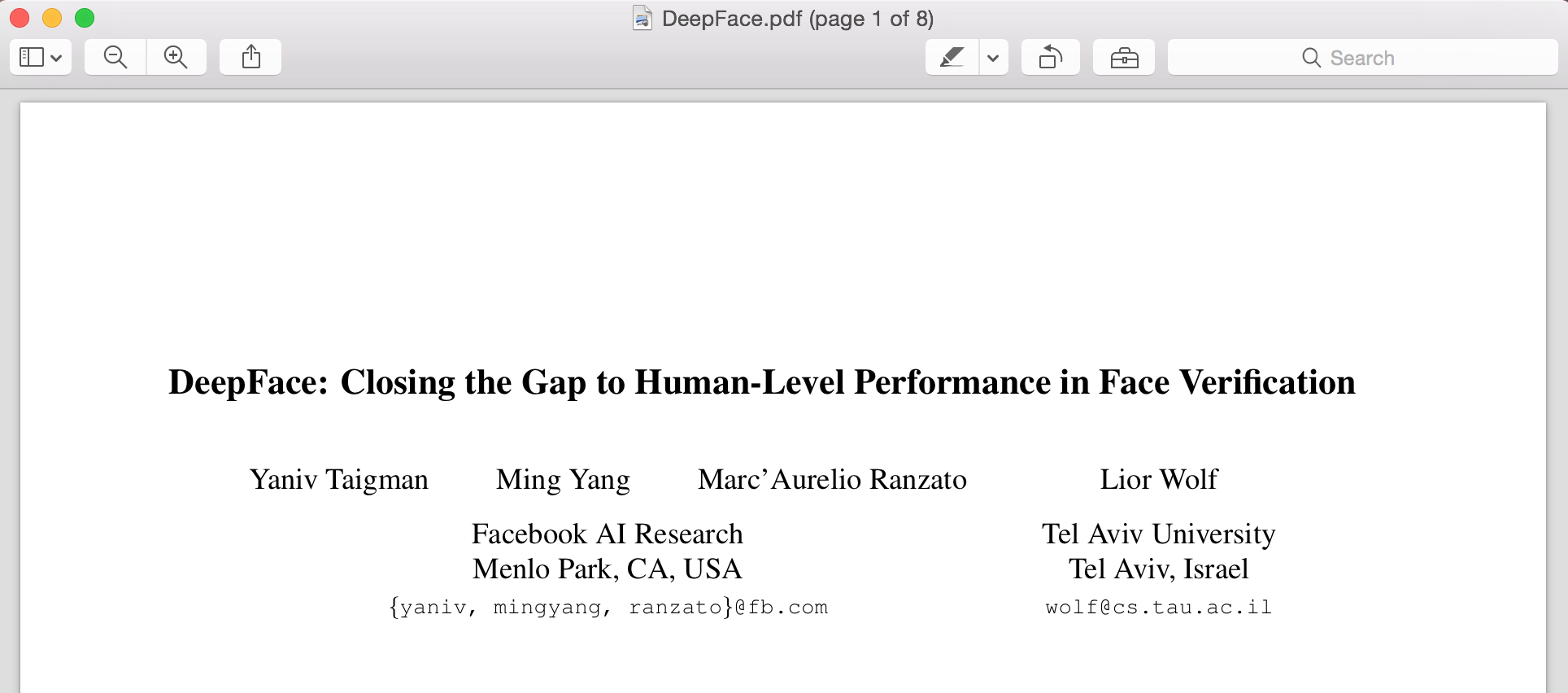
PDF Viewer
This is how documents look like in the PDF Viewer. I think it’s neat.
The Task-bar
This is how the Task-bar looks like. Icons, fonts and spacing all seem different.
Color-changing
The background color scheme affects the opaqueness of an element. Note drop-down here.
Deeper look into Finder
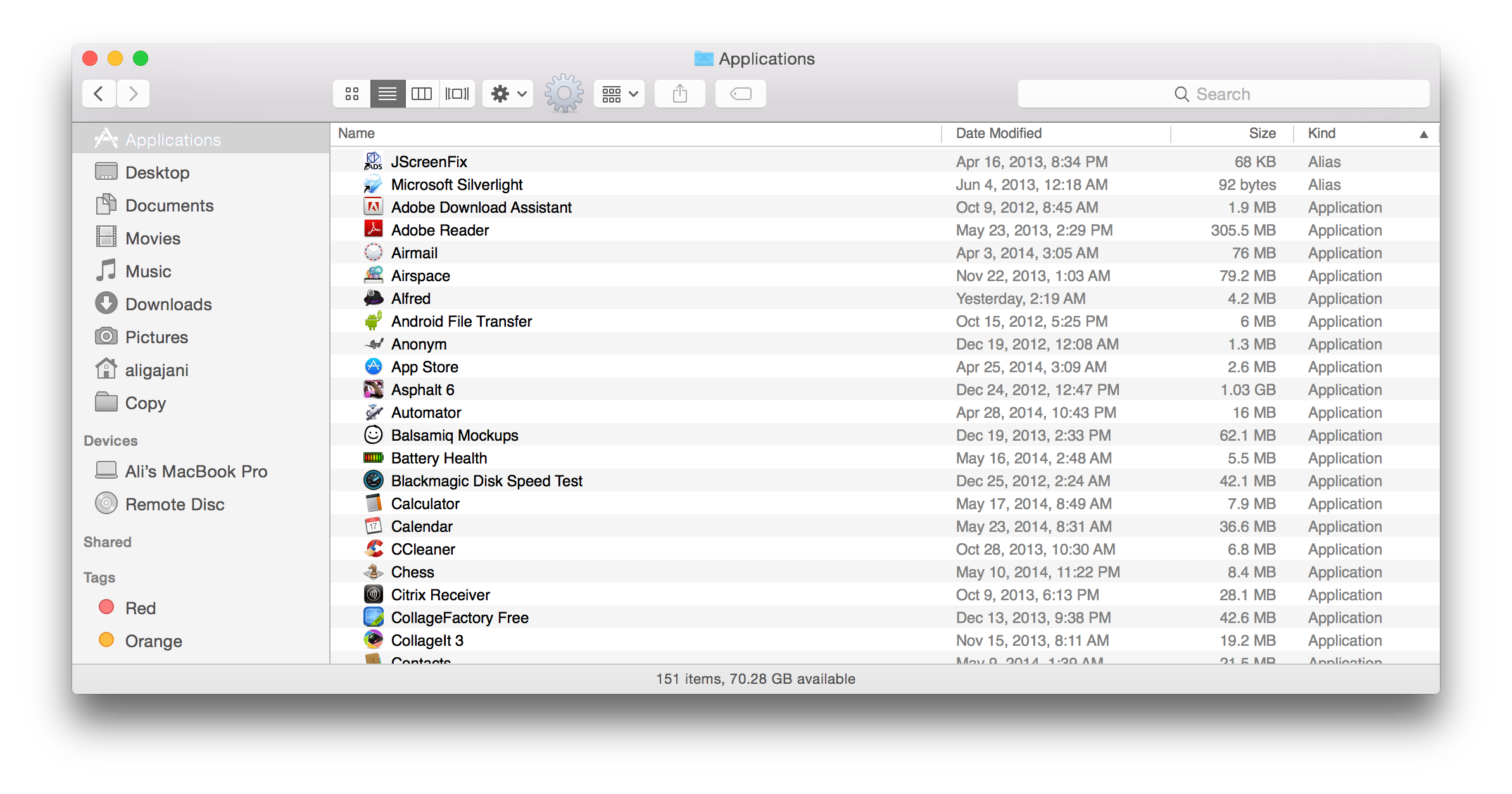
The Finder looks very refreshed. Note the overall look and feel around the edges.
Where’s Photo-booth?
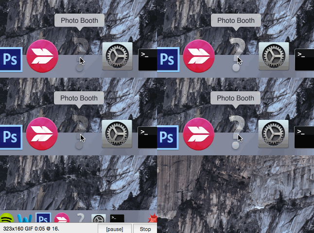
Okay, so did Yosemite just gulp my Photo-booth app. Yes, yes, damn!
Tim Cook’s Priorities
He makes a great Bin icon. Check that icon, must’ve taken ages.
But apparently he forgot to fix the title on my browser. No probs mate.
Activity Monitor
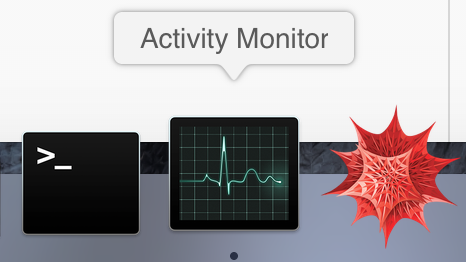
If you noticed before, the Dock missed the Activity Monitor icon, well it’s back suddenly. So long bud.
New Preview Icon
Well, there you have it, a crisp new Preview icon.
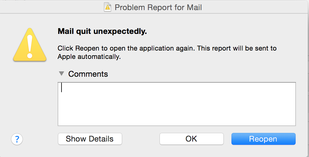
Apple Mail
This is how Mail welcomed me. Not too shabby, let’s try again. Nope, same again.
Conclusion
Yosemite is a refreshing new OS from Apple, but the beta is far from perfect. My recommendation is to wait. I took the chance so you don’t have to. There are tons of bugs lying here and there and it’s not a good idea to use an un-stable release if you use your machine for critical work. I hope my review was entertaining and useful. Take care, bye.
About Ali Gajani
Hi. I am Ali Gajani. I started Mr. Geek in early 2012 as a result of my growing enthusiasm and passion for technology. I love sharing my knowledge and helping out the community by creating useful, engaging and compelling content. If you want to write for Mr. Geek, just PM me on my Facebook profile.









Pingback: How to fix the Wifi bug in Yosemite using Keychain reset? - Mr. Geek()